
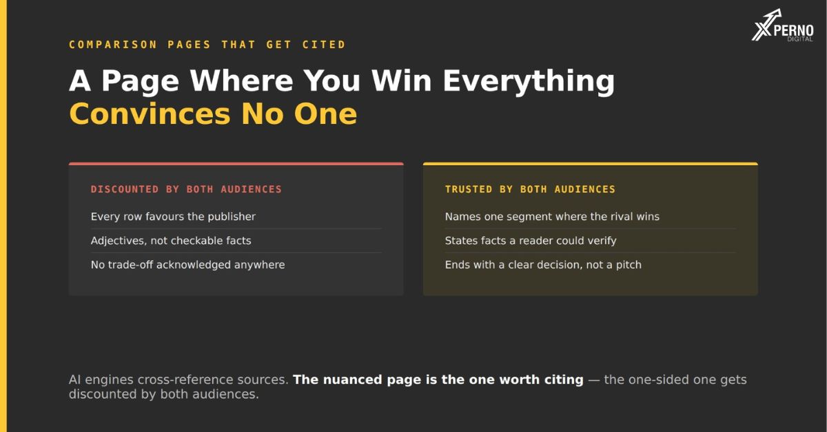
A comparison page gets cited when it names at least one segment where the competitor is genuinely the better choice, states checkable facts rather than adjectives, and ends with a clear decision. Pages where every row favours the publisher are discounted by human readers and provide weak signal to AI engines cross-referencing multiple sources.
Comparison pages are the most-cited content type when AI engines answer B2B software recommendation queries, and they target the highest-intent searches in most categories. They are also the pages most companies build badly.
Why do most comparison pages fail?
Because both audiences for the page discount a source where every judgement favours the publisher.
Human readers evaluating software have read a dozen of these. The format is familiar and the pattern is obvious: green checkmarks down one column, red crosses down the other, a conclusion that was clear from the headline. A page with no acknowledged trade-off reads as collateral rather than information, and the bounce rate reflects it.
AI engines cross-reference sources when assembling an answer. When your page claims you win on every dimension, a competitor’s page claims the reverse, and a third-party review says something more nuanced, the nuanced source is the more useful one to draw on.
Both discount it for the same underlying reason: the page contains no information that could not have been predicted from knowing who wrote it.
What does an honest concession look like?
A concession is only credible if a prospect could read it and reasonably choose the competitor. Vague qualifications do nothing.
A concession that does not work:
[Competitor] may be a better fit for very large enterprises
with complex requirements.
Vague, self-flattering by implication they are for the bloated enterprise, you are for the nimble team and it excludes almost nobody. A reader sees through it immediately.
A concession that works:
[Competitor] handles multi-currency invoicing natively. We do not.
Customers operating across more than two currencies typically run a
separate finance tool alongside us, and if that is a dealbreaker,
they are the better choice.
Specific, checkable, and it genuinely disqualifies a segment. A reader believes it because it costs you something.
The test: would a prospect ever choose your competitor after reading your concession? If not, it is not one.
Why does the concession make the page work?
It establishes that you are describing reality rather than advocating, which makes every other claim on the page believable.
The cost is real you lose the prospects who need the thing your competitor does better. Those prospects would have churned, complained, or asked for a refund. Whether that is a cost depends on whether you count revenue or retained revenue.
Poor-fit customers also consume disproportionate support time and leave critical reviews. A page that filters them before a discovery call is doing sales qualification at no cost.
What should a comparison page contain?
Seven sections, in this order.
| Section | What it contains |
| 1. Direct answer | 100–150 words stating who each product suits. Most-extracted section write it last. |
| 2. Comparison table | Checkable facts only. Pricing, user limits, integrations, deployment, support tiers. |
| 3. Where each is stronger | Two clearly labelled sections, both substantive. If theirs is three lines, the page is not balanced. |
| 4. Pricing comparison | Explicit and current. Heavily extracted and commonly outdated. |
| 5. Who should choose which | Specific customer profiles, not generalities. |
| 6. Migration notes | What switching involves. Rarely provided, genuinely useful, signals confidence. |
| 7. FAQ | The real questions buyers ask about this comparison. Mark up with FAQPage schema. |
What makes the facts on the page extractable?
Specific, checkable values not adjectives.
“Starts at $49 per user per month, five-seat minimum” is extractable. “Flexible pricing that scales with you” is not, by a buyer or by a model.
Use pricing, user limits, supported integrations, deployment options, API availability and contract terms. “More intuitive” is an assertion, not a comparison.
Structure matters too. Every heading should be a question a buyer would ask, answered completely in the first sentence beneath. A table with consistent labels is easier to extract from than prose.
Which competitors should you build pages for?
The three or four that actually appear in your deals not the largest companies in your category.
Pull the last fifty won and lost deals from your CRM and count which names come up. If sales does not record this, ask them; they will answer accurately in five minutes.
The market leader may never appear if you sell to a segment they do not serve. Building a page against a competitor you never actually face is effort spent on a query your buyers do not run.
Three or four pages is the right number. More becomes unmaintainable, and stale comparison pages are worse than absent ones.
How often should comparison pages be updated?
Quarterly. You are publishing facts about another company’s product, and those facts change.
An outdated comparison is worse than no comparison, because being demonstrably wrong about a checkable fact a competitor’s current pricing, a feature they have since shipped undermines every other claim on the page.
Add a visible “last updated” date. It signals currency to readers and creates an internal deadline.
Is it legal to name competitors on your website?
Comparative advertising using factual, substantiated claims is standard practice in B2B software in most jurisdictions.
Avoid unsubstantiated claims and trademark use implying endorsement. Check sector-specific rules if you operate in a regulated industry.
The more common objection is commercial rather than legal: why give a competitor attention? The answer is that the comparison happens regardless. Buyers ask for it, third parties publish it, and your competitors almost certainly publish a page about you. The choice is not between comparing and not comparing it is between being represented and being described entirely by others.
When does a comparison page not help?
When your competitor is genuinely better across the board, or when you cannot name a single thing they do well.
The first is a positioning problem rather than a content problem. Find the segment where you genuinely win and build the page around that honestly.
The second is worth examining. Either you have not looked closely at the market, or you are not being straight with yourself about it. Both are worth knowing before the page gets written.
Frequently Asked Question :
Is it legal to name competitors on a comparison page?
Comparative advertising using factual, substantiated claims is standard practice in B2B software in most jurisdictions. Avoid unsubstantiated claims and trademark use implying endorsement.
Will a comparison page send traffic to my competitor?
Some. But the visitor was already comparing you both. A page where they find balanced information from you beats one where their only source is your competitor’s version.
How many comparison pages should I build?
Three or four, against the competitors that actually appear in your deals. More becomes unmaintainable, and stale pages are worse than absent ones.
What if my competitor is genuinely better overall?
That is a positioning problem rather than a content problem. Find the segment where you win and build the page around it honestly.
How long should a comparison page be?
1,200–1,800 words with a clear table. Longer pages bury the claims that matter.
How often should I update comparison pages?
Quarterly. You are publishing facts about another company’s product, and being wrong about a checkable fact undermines the whole page.