
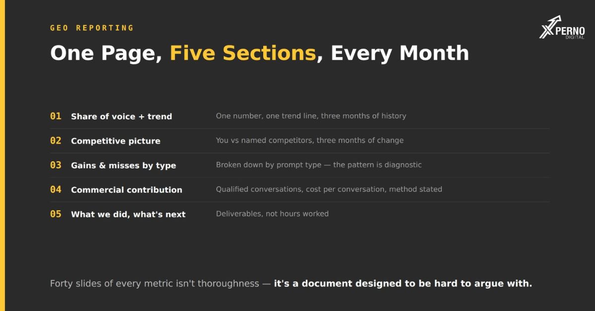
A monthly GEO report should fit on one page and lead with competitive position and pipeline contribution not with rankings, traffic or activity counts.
The purpose of the report is to let a founder decide whether to keep funding the work. That decision needs three things: where you stand relative to competitors, whether it is improving, and what it is contributing commercially.
Most reporting fails because it optimises for the wrong thing. Forty slides of every available metric is not thoroughness it is a document designed to be hard to argue with, and it is usually treated accordingly.
Why does length work against you?
A report nobody reads cannot build confidence, and a report that cannot be interrogated cannot build trust.
Two failure modes, both common:
The comprehensive deck: Every metric available, forty slides, sent monthly. It gets skimmed for the summary slide. The rest is unread, which means the effort produced no informational value and it quietly signals that the sender is hiding the important number among the unimportant ones.
The activity report: Pages published, links built, hours spent. It answers “what did you do” rather than “did it work.” A founder reading it learns you were busy.
One page, five sections, is enough. If something needs more space, it belongs in an appendix nobody is required to read.
The five sections:
1. Share of voice, and the trend:
Lead with this. One number, one trend line, three months of history.
Share of voice: 11% (up from 8% three months ago)
Across 20 buyer prompts, ChatGPT + Perplexity + AI Overviews
Why this and not appearance rate? Appearance rate rises when the whole category gains coverage, which makes it look like your work succeeded when your relative position may have worsened. Share of voice controls for that.
2. The competitive picture:
The section a founder actually wants, and the one most reports omit.
- Vendor Share of voice 3-month change
- Competitor A 24% +2
- Competitor B 19% −1
- Us: 11% +3
- Competitor C 9% −2
Three numbers per row. It answers where you stand, who is ahead, and whether the gap is closing which is the whole question.
3. Where you gained, and where you did not
Break movement down by prompt type, because the pattern is diagnostic and because it manages expectations correctly.
- Moved: Alternatives queries (2→5 of 6), direct brand queries (1→3 of 3)
- Unchanged: Broad category queries (0 of 4) expected; these take 6–12 months
- Declined: None this month
Why this section matters? Specific queries move before broad ones. Without stating that, flat head-term numbers read as failure and undermine confidence in work that is progressing normally.
4. Commercial contribution
Translate the visibility number into something a founder can weigh against other spending.
Organic contributed 6 qualified conversations this month (4 last month).
Cost per qualified conversation: $X vs $Y for paid.
Attribution method: first-touch, with 30% of organic conversations self-reported as “found via AI tool or search” on the demo form.
Be explicit about the method and its imperfection. An imperfect number with a stated method beats a precise number for a metric nobody cares about. Attribution in this channel is genuinely poor, and pretending otherwise damages credibility when someone probes.
5. What we did, and what is next?
Four to six lines. Deliverables, not hours.
Completed: 2 comparison pages live, schema on product pages, 8 roundup approaches sent (2 responses)
Next month: Alternatives page for [competitor], review request automation live, 8 further approache
What should you leave out?
Five things that appear in most reports and should not
Rankings: They are a leading indicator at best and they invite a conversation about positions rather than pipeline.
Traffic totals: Dominated by branded and returning visits, which mask what is actually changing.
Impressions and keyword counts: Neither predicts revenue.
Hours worked: Effort is not an outcome, and reporting it invites a conversation about rates.
Anything requiring a glossary: If the founder needs to understand retrieval mechanics to read the report, it will not get read.
Put these in an appendix: if someone genuinely wants them. Do not lead with them.
Why include what did not work?
Every founder knows not everything succeeds, and a report with no misses makes the successes less believable.
This is the single most useful reporting habit in this discipline, and it is rare.
The context that makes it matter. AI visibility work is measured by manual prompt testing that the client cannot easily verify. They are largely taking your word for it. In that situation, the willingness to report a miss is one of the few available credibility signals.
what a good miss section looks like?
Did not move: The four broad category prompts. Expected at this stage, but worth noting that in this category the incumbents have a decade of accumulated presence and the head query may not be winnable at all. We will reassess at month six and reallocate if so.
What it achieves? It sets expectations before they are violated. It demonstrates that the numbers are being read rather than presented. And when you do report a win, it is believed.
How do you handle a bad month?
Report it plainly, explain what you think happened, and state what you are changing.
Bad months happen. Engines update, competitors publish, output varies.
A workable structure: Share of voice fell from 12% to 10%. Two things likely contributed: [Competitor B] published a comparison page against us that is now being cited, and one of the roundups feeding our category was updated without us in it. We have drafted a response comparison page and re-approached that publication. Reassessing in 30 days.
Three things that structure does: It states the number without softening it. It offers a specific hypothesis rather than a vague one. It names an action and a review date.
What to avoid: attributing every decline to “algorithm changes.” It may be true and it is unfalsifiable, which means it reads as an excuse whether or not it is one.
Should the report be automated?
Partly. Automate the data collection; write the interpretation.
The numbers can come from a spreadsheet you maintain monthly. The sections that matter what moved and why, what you are changing, whether the head query is realistic require judgement.
A fully automated report has the same problem as a forty-slide deck: it presents data without a view, which leaves the reader to work out whether the work is succeeding. That is your job, and doing it is most of the value of the report.
Frequently Asked Questions:
How long should a GEO report be?
One page. Anything longer belongs in an appendix that nobody is obliged to read.
How often should I report?
Monthly. More frequently produces noise from output variability; less frequently loses the thread.
Should I include screenshots of AI answers?
One or two, where they illustrate a specific change. A gallery of screenshots is padding.
What if the client wants rankings included?
Include them in an appendix, but do not lead with them. Leading with rankings trains the conversation toward positions rather than pipeline.
How do I report on a month where nothing moved?
Report the flat numbers, state what was delivered, and say when you expect movement. Months two and three are typically flat by design if that was set out in advance, a flat month is not a surprise.
Should reporting be the agency’s job or the client’s?
Whoever produces it, one person should own the interpretation. A report with numbers and no view is not a report.